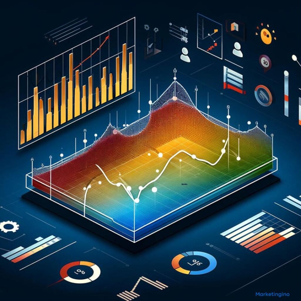
An area chart is a graphical representation of data that combines the features of a line chart with the added benefit of filling in the space under the line to form a visual area. This type of chart is particularly useful for illustrating the magnitude of change over time and comparing multiple data series.
What is an Area Chart?
An area chart displays quantitative data graphically and is constructed by plotting data points on a Cartesian coordinate system. These points are then connected by straight line segments, and the area between the line and the x-axis is filled with color or shading. This filled area helps to emphasize the volume of data and provides a clear visual representation of trends and patterns.
How Area Charts Work
- Data Points: Data points representing values at specific time intervals or categories are plotted on the chart.
- Connecting Lines: These points are connected by straight lines, similar to a line chart.
- Filled Area: The area between the line and the x-axis is filled with color or shading, creating a solid area that represents the magnitude of the data.
Types of Area Charts
- Simple Area Chart: A single data series is plotted, and the area under the line is filled. This type is useful for showing changes in a single variable over time.
- Stacked Area Chart: Multiple data series are stacked on top of each other. Each series’ area is filled with a different color, and the total height of the stacked areas shows the cumulative value. This type is useful for comparing multiple variables and understanding their collective contribution.
- 100% Stacked Area Chart: Similar to a stacked area chart, but the values are normalized to represent percentages, making it easier to compare relative contributions across different categories.
- Overlapping Area Chart: Multiple data series are plotted on the same chart, but the areas overlap each other. This can be useful for comparing trends across different series but may become cluttered with too many series.
Benefits of Using Area Charts
- Visual Impact: The filled area creates a strong visual impression, making it easier to perceive the volume of data and trends over time.
- Trend Identification: Area charts effectively highlight trends, patterns, and changes in data over time, helping to identify significant movements.
- Comparative Analysis: Stacked and 100% stacked area charts facilitate comparison between multiple data series, showing both individual and cumulative contributions.
- Data Emphasis: Filling the area under the line emphasizes the magnitude of data, making it more intuitive to understand large datasets at a glance.
Best Practices for Creating Area Charts
- Limit Data Series: Avoid overcrowding the chart with too many data series, as this can make it difficult to interpret. Aim for a maximum of three to four series for clarity.
- Use Distinct Colors: Choose distinct and contrasting colors for different data series to ensure they are easily distinguishable.
- Add Labels and Legends: Clearly label the axes and include a legend to help users understand what each area represents.
- Highlight Key Data: Use annotations or highlight specific data points to draw attention to important trends or changes.
- Consider the Audience: Ensure that the chart is designed with the audience in mind, making it as clear and informative as possible.
Examples of Effective Area Charts
- Simple Area Chart:
- Use Case: Showing the increase in website traffic over a year.
- Example: Monthly website visitors with the area under the line filled to emphasize growth.
- Stacked Area Chart:
- Use Case: Comparing sales contributions of different product categories over time.
- Example: Quarterly sales data for multiple product lines stacked to show total revenue and individual contributions.
- 100% Stacked Area Chart:
- Use Case: Illustrating market share distribution among competitors.
- Example: Market share percentages of various companies over the last five years.
Benefits of Using Area Charts
- Clear Trend Visualization: Area charts provide a clear and compelling way to visualize trends and changes in data over time.
- Effective Comparisons: They enable effective comparison of multiple data series, especially when showing cumulative totals.
- Enhanced Data Presentation: The filled areas make data presentation more engaging and easier to understand at a glance.
- Highlighting Volume: Area charts emphasize the volume of data, making it easier to perceive the magnitude of changes and trends.
Challenges of Using Area Charts
Despite their advantages, area charts present challenges:
- Overlapping Data: With multiple series, overlapping areas can become cluttered and hard to read.
- Misinterpretation: Without clear labels and legends, users might misinterpret the data, especially in stacked charts.
- Complexity with Many Series: Too many data series can make the chart complex and difficult to interpret.
Area charts are a powerful tool for visualizing data, combining the clarity of line charts with the added emphasis of filled areas. By highlighting trends, patterns, and magnitudes of change, area charts make it easier to understand complex datasets. When used appropriately, they can enhance data presentation, facilitate comparative analysis, and provide valuable insights into data trends. As data visualization continues to play a crucial role in decision-making, mastering the use of area charts will be an essential skill for analysts and marketers alike.


