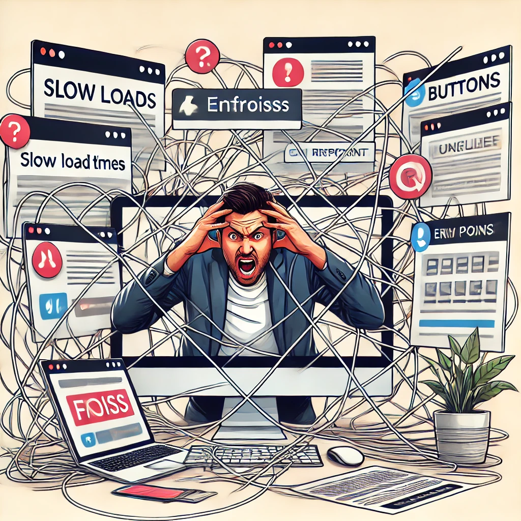
In today’s digital age, providing a seamless and intuitive experience on websites is essential for businesses. Whether it’s an e-commerce platform, an informational site, or a service portal, users expect quick, easy, and frustration-free interaction. However, many current or prospective customers face pain points during their online journey that can cause them to leave the site or become dissatisfied with the experience. These pain points are the specific problems users encounter when interacting with a website, and addressing them is critical to improving user satisfaction and conversion rates.
What is a Pain Point?
A pain point is any obstacle, issue, or frustration that a user encounters while navigating a website or attempting to complete a specific action. These can range from technical problems to user experience design flaws that make it hard for users to achieve their goals. Identifying and resolving these pain points is crucial for improving customer retention and ensuring a smooth journey through the site.
Common pain points faced by users include:
- Slow Load Times Websites that take too long to load can frustrate users, causing them to abandon the page and look for alternatives. According to studies, users expect a page to load within two to three seconds, and anything longer significantly increases bounce rates.
- Complex Navigation If customers cannot easily find what they’re looking for due to poor site structure or unclear menus, they are more likely to leave. Websites with complex, cluttered, or confusing navigation can make it difficult for users to locate products, services, or key information.
- Non-Responsive Design With the rise of mobile browsing, websites must be optimized for a variety of devices. Non-responsive websites that don’t adjust to different screen sizes or function properly on mobile devices create a frustrating experience for users and often lead to high abandonment rates.
- Lack of Clear Call to Action (CTA) Users need clear guidance on what actions to take next. Websites with ambiguous or poorly placed CTAs can leave customers confused about how to proceed, whether they want to make a purchase, sign up for a service, or request information.
- Complex Checkout Processes For e-commerce sites, one of the biggest pain points is a complicated or overly long checkout process. If users encounter too many steps, unnecessary forms, or technical glitches during checkout, they are likely to abandon their cart, leading to lost sales.
- Poor Search Functionality Users who rely on the search function to find specific products or information expect relevant and accurate results. A poorly functioning search tool that returns irrelevant results or is difficult to use can be a major pain point, driving users away.
- Lack of Trust Signals Security and trust are critical concerns for online users. Websites that lack SSL certificates, don’t display clear privacy policies, or fail to include customer reviews or testimonials may cause users to hesitate in completing transactions due to concerns over privacy and fraud.
- Inadequate Customer Support When customers face an issue, they expect quick and easy access to support. Websites that lack visible or accessible customer service options (e.g., live chat, contact forms, or phone numbers) frustrate users, particularly when they encounter problems and need immediate assistance.
How to Address These Pain Points
Businesses can take several steps to identify and eliminate pain points on their websites:
- Conduct User Research Understanding how users interact with the site is key. Utilize analytics, heatmaps, and user testing to identify where users drop off or encounter issues. Surveys and direct feedback from customers can also shed light on common frustrations.
- Optimize for Speed Ensuring fast load times is critical to reducing bounce rates. This can be achieved by compressing images, leveraging browser caching, and minimizing the use of heavy scripts that slow down the site.
- Simplify Navigation A clear and intuitive navigation structure makes it easy for users to find what they’re looking for. Use a simple and logical menu hierarchy, with breadcrumbs and search bars available to enhance the user’s ability to move through the site effortlessly.
- Focus on Mobile Responsiveness Ensure your site works seamlessly across all devices. A responsive design that adjusts automatically based on the user’s screen size improves mobile usability and reduces frustration for users on tablets and smartphones.
- Streamline Checkout Processes Minimize the number of steps in the checkout process, offer guest checkout options, and make sure forms are easy to fill out. Highlighting secure payment options and providing real-time help during checkout can further reduce abandonment rates.
- Improve Search Functionality Implement advanced search features such as auto-suggestions and filters to help users quickly locate what they need. A well-optimized search function can greatly enhance the user experience and improve conversion rates.
- Build Trust Display security badges, use SSL certificates, and include customer reviews and testimonials to build trust. Make privacy policies and terms of service easily accessible to ensure users feel confident in making transactions.
- Enhance Customer Support Offering multiple support channels, such as live chat, email, and phone support, ensures users can get help when they need it. A well-designed FAQ section and self-service options can also reduce the burden on customer support teams.
Pain points in website interaction can significantly hinder user experience and hurt a business’s bottom line. By identifying and addressing these common challenges, companies can create a smoother, more enjoyable experience that encourages users to stay longer, engage more, and ultimately convert. Regularly reviewing and optimizing site performance is crucial to maintaining a competitive edge in today’s fast-paced digital landscape.


